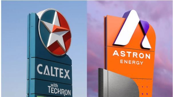
Astron Energy reveals its new look for Caltex service stations across South Africa
Astron Energy has unveiled its new logo and branding which will adorn more than 850 Caltex-branded service stations in South Africa and Botswana.
Caltex’s iconic red, white, and blue branded service stations, which have an 85-year history in South Africa, are being phased out. In its place comes the orange, white, and purple of Astron Energy following a takeover of the Caltex network in South Africa in 2018. In August this year, Astron announced that it would become the overarching brand, in name and identity, across Caltex’s corporate, commercial, and retail fronts.
Backed by commodities trading giant Glencore, Astron’s takeover, using the pre-emptive rights held by a black empowerment partner, was estimated to be worth nearly $1 billion.
Astron Energy unveiled its new logo, branding, and corporate identity on Wednesday, adding, in a press statement, that Caltex forecourts would be converted to this new look "over the next few years".
"The rebrand is a milestone moment for us on our journey to reimagine and reinvent ourselves," said Astron Energy Interim CEO, Braam Smit.
"We have been a trusted player in fuels for over a century. We are looking forward to stepping confidently into the future and welcoming all our customers to our exciting new-look forecourts and experiences."
Astron Energy added that the dramatic change from Caltex’s white-starred logo was done to "stand out in a largely undifferentiated market which tends to stick to the traditional colours usually associated with fuel brands".
And it's not just service station forecourts which will get an Astron Energy makeover. Astron's Cape Town refinery, lubricants manufacturing plant in Durban, 15 terminals, 180 commercial and industrial sites, and corporate facilities will all get the same treatment.
"Our new colours and design were carefully chosen to represent our rich new corporate identity which is fuelled by progress and inspired by the potential in all of us," said Cambridge Mokanyane, Astron's general manager of marketing.
"Colours that are distinctive and non-traditional for the fuel sector, and a logo that is uniquely identifiable were key criteria during the brand development process."
News Category
- International retailers
- On the move
- Awards and achievements
- Legislation
- Wine and liquor
- Africa
- Going green
- Supplier news
- Research tools
- Retailer trading results
- Supply chain
- Innovation and technology
- Economic factors
- Crime and security
- Store Openings
- Marketing and Promotions
- Social Responsibility
- Brand Press Office
Related Articles

Warning of Eskom collapse

Knorr recalls brown onion gravy sachets

Eskom CEO shares good news about load-shedding

Tax warning for South African businesses


